Restaurant menu
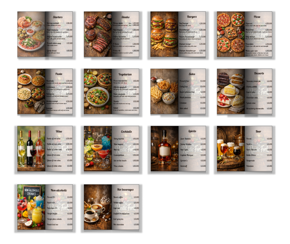
This restaurant menu is a mock up I designed with the full intention of fooling people into thinking it’s a real, functioning piece of culinary branding. I laid everything out so cleanly that diners won’t even realise the food doesn’t exist, but the spacing? Oh, the spacing is very real. The headers are bold enough to scream “professional designer at work,” while the descriptions are spaced just right so no one suspects I spent half an hour debating whether “juicy” sounded too aggressive. The visual hierarchy gently guides the eye like a friendly hostage situation and the whole thing looks so polished that customers might try to order from it anyway. Honestly, for a mock up, it’s doing a suspiciously good job pretending it has a Michelin star.

Leave a comment